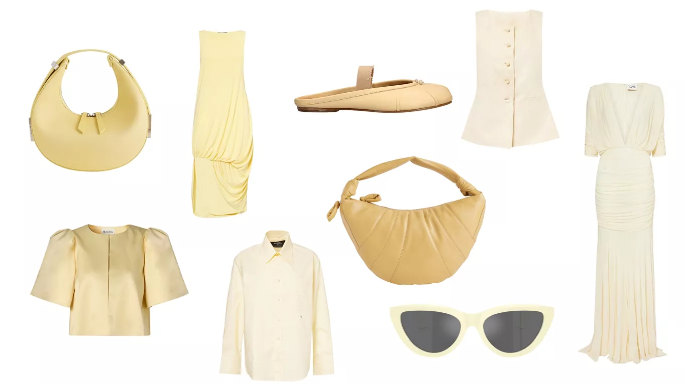
A soft, inviting shade of butter yellow is officially taking center stage as the color of the season in European fashion. This luminous and optimistic hue is now appearing everywhere, from subtle nail polish tones to elaborate red carpet couture gowns.
Its widespread adoption signals a significant shift in prevailing color trends, marking it as a versatile and surprisingly sophisticated choice for the coming season.
The Appeal of Butter Yellow: The “New Neutral”
The undeniable charm of butter yellow lies in its bright yet gentle nature.
Versatility and Optimism
Leading figures in the fashion industry are enthusiastically labeling butter yellow as “the new neutral.” They applaud its remarkable versatility and seamless compatibility with a wide range of wardrobe staples. Imagine it effortlessly paired with classic blue denim or sleek black attire.
Much like its namesake, this color easily integrates into any personal style repertoire, offering a fresh alternative to more traditional neutral tones. It brings an element of sun-kissed optimism without being overpowering.
Spreading Through Retail
At Selfridges, the iconic London department store known for its own chrome yellow branding, the new butter yellow variant is prominently featured across the store. Laurie Field, Selfridges Buying Manager, confirms its widespread influence: “We’ve seen butter yellow spread across the runway for SS25, with brands like Alaia, Toteme, and 16Arlington all presenting soft, pale yellow hues across various silhouettes and accessories.”
Field suggests embracing the shade with pieces such as Lemaire’s fortune croissant bag, Khaite’s zesty cashmere jumper, or Posse’s airy linen set.
From High Street to Haute Couture: A Universal Trend
The influence of butter yellow spans the entire fashion spectrum, from accessible high street brands to exclusive haute couture.
High Street Accessibility
At Uniqlo, where British-born Clare Waight Keller serves as the relatively new creative director, butter yellow is already readily available. You can find it in their soft ribbed jersey polo tops, comfortable bra tops, and practical pocketable UV protection zip jackets. Having previously honed her skills at prestigious design houses like Givenchy, Chloe, and Gucci, Waight Keller is now applying her renowned prowess to one of the most impactful movers in high street retail.
She notes, “It is a whole new territory for me and leads me deep into technological and material advances, as well as overseeing the color, silhouettes, and styles.”
Elevated Elegance in Couture
Butter yellow has even permeated the rarefied echelons of haute couture. Australian couturier Tamara Ralph made it a central focus of her January collection, presented in Paris. For Ralph, a designer known for her dreamy, flamboyant gowns favored by stars such as Bella Hadid and Priyanka Chopra, yellow is a natural fit.
“In my opinion, the right color can completely transform a look and its overall feeling,” says Ralph. She crafted exquisite pieces in this hue, including a gorgeous, airy off-the-shoulder taffeta gown and a crystal siren gown embellished with delicate ostrich feather pom-poms. Ralph refers to it as “baby yellow,” noting that it “brings with it an element of joy and cheerfulness, but in such a way that is still elegant and innately feminine: it is more quietly luxurious than a bright hued yellow.”
Adorned in Fine Jewelry
Beyond apparel, butter yellow is also being championed by fine jewelry designers. Cora Sheibani, who specializes in highly artful one-off pieces, is a proponent of the shade. She currently incorporates numerous citrines, which her stone cutter affectionately calls “Palmeira citrine.”
Sheibani explains, “It has a beautiful deep color that pairs so well with other stones and looks great on most people.” She recently designed a “fabulous piece with a huge round Sphalerite,” a stone she had never worked with before, describing its appearance as “like the sun.”
The Mechanism Behind a Color Trend
Understanding how a color trend gains momentum involves a complex interplay of industry forces.
The “Devil Wears Prada” Effect Revisited
Remember the famous scene in The Devil Wears Prada? Miranda Priestly (Meryl Streep) lectures Andrea Sachs (Anne Hathaway) on the authoritative role of high fashion in dictating color trends to consumers. Priestly explains how “cerulean blue” trickled down from the runway, eventually coloring Sachs’ cable knit sweater.
She asserted, “That blue represents millions of dollars and countless jobs, and it’s sort of comical how you think that you’ve made a choice that exempts you from the fashion industry when, in fact, you’re wearing a sweater that was selected for you by the people in this room. From a pile of ‘stuff’.”
However, butter yellow isn’t merely trickling down; it’s arriving as an exuberant wave, crashing over the industry. The exact tone would have been decided upon over three years ago. This process involves dye manufacturers, trend forecasters, and fabric makers who collectively determine the color palette for the 2025 season.
These materials are then showcased at trade fairs, such as Premiere Vision in Paris. Here, designers select their palettes and order fabrics, which directly influence the look and feel of their upcoming collections.
The Commercial Imperative
When a color like butter yellow or BarbieCore pink (which trended in 2024) gains traction, there’s a strong commercial imperative for brands to align with that direction. Fashion trends shift through a consensus among industry players.
Celebrity Influence and Early Adoption
Early adopters play a crucial role in amplifying a trend. Consider Timothée Chalamet in his custom-made butter yellow suit at the Oscars. Designed by Givenchy’s new creative director, Sarah Burton, his look appeared fresh and playful against the sea of traditional black tie. His appearance not only heralded a new chapter at Givenchy but also helped to kickstart a mass fashion trend.
Since then, celebrities like Rihanna, Sabrina Carpenter, and Hailey Bieber have all sported butter yellow, significantly boosting its visibility and desirability. If you’re tempted to try the trend, an easy entry point is Chanel Le Vernis nail polish in Ovni.
Embracing the “Everyday Gold”
The shift towards butter yellow signifies a broader embrace of color in fashion.
A Fresh Take on Neutrals
“I think that, generally, more designers and brands are embracing the use of color,” says Tamara Ralph. “And color in unexpected hues. With yellow specifically, you often see tones of mustard, lemon, and even veering into more of a cream, but butter yellow offers a fresh, new take.” She advises pairing this distinct color with well-tailored suits or separates, or, at the other end of the spectrum, with elegantly draped, billowy gowns. Minimal or subtle embellishment allows the color to truly shine.
Versatility for All
This rotation in color trends is a way for the fashion industry to signal “freshness.” The true power of butter yellow lies in its remarkable versatility. Laurie Field of Selfridges states, “Butter yellow is a gentle way to introduce color to your wardrobe, the new neutral. It’s easy to wear and flattering for all skin tones.” Once you start noticing it, you’ll likely spot this captivating hue everywhere. Consider it a subtle, everyday form of gold, adding warmth and sophistication to your style.


